A compelling prompt is the gateway to user mesh and conversion. It makes it a pivotal element in any online campaign. Our guide explores the art of crafting effective CTAs that resonate with audiences, driving them to take desired actions. It is from clear and concise messaging to strategic placement. We delve into the key strategies that elevate CTAs into powerful tools. They help enhance click-through rates and conversions. Businesses can optimize their online presence by understanding and implementing CTA best practices. They may create a seamless journey for users and maximize the impact of their digital marketing efforts.
The Art of CTA Optimization
Compelling Call to Action escalation is an art. It extends beyond persuasive language—strategic CTA placement is equally crucial. In this section, we explore the nuances of maximizing its impact. We do it by strategically positioning it within digital content. We choose prominent spaces to align with user flow. We unravel the intricacies that elevate a CTA’s influence. Businesses can significantly enhance user engagement by mastering the art of CTA optimization. Also, they may drive conversions, ensuring that the call to action becomes a seamless and compelling part of the user experience.
Effective CTA Placement Strategies

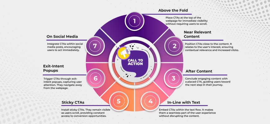
Crafting a compelling Call to Action is only part of the equation. Strategic location is equally crucial for optimal results. Explore these CTA placement strategies to elevate your digital engagement:
- Above the Fold: Place CTAs at the top of the webpage for immediate visibility without requiring users to scroll.
- Near Relevant Content: Position CTAs close to the content. It relates to the user’s interest, ensuring contextual relevance and increased clicks.
- After Content: Conclude engaging content with a placed CTA, guiding users toward the next step in their journey.
- In-Line with Text: Embed CTAs within the text flow. It makes them a seamless part of the user experience without disrupting the content.
- Sticky CTAs: Install sticky CTAs. They remain visible as users scroll, providing constant access to conversion opportunities.
- Exit-Intent Popups: Trigger CTAs through exit-intent popups, capturing user attention. They navigate away from the webpage.
- On Social Media: Integrate CTAs within social media posts, encouraging users to act immediately.
You can optimize user interaction, boost engagement, and drive conversions seamlessly. Mastering these best CTA practices ensures that your Call to Action captures attention. Also, guide users toward meaningful actions, enhancing the impact of your online campaigns.
Analyzing and Improving CTA Strategy

Analyzing and improving your Call to Action plan is crucial for enhancing user engagement. Here are vital steps to refine your CTA approach:
- Performance Metrics Analysis: Test CTA uses indexes like CTR and CR to identify strengths and weaknesses.
- A/B Testing: Conduct A/B testing with variations in CTA copy, design, or placement to identify the most effective elements.
- User Feedback: Gather feedback from users through surveys or analytics. It will help you to understand their preferences and pain points.
- Competitor Benchmarking: Analyze CTAs used by competitors to identify successful strategies. Also, potential areas for improvement.
By analyzing and refining your CTA optimization, you can ensure that your calls to action are not only practical. They are also aligned with user expectations. You can maximize your impact in driving desired actions and improving campaign success.
Conclusion
Our platform will be handy for you. The ultimate aim remains clear as we delve into improving CTA best practices. It is to inspire users to make a deposit with our platform and engage with our traffic. Deposit and unlock the full potential of their online presence with ReachEffect.


