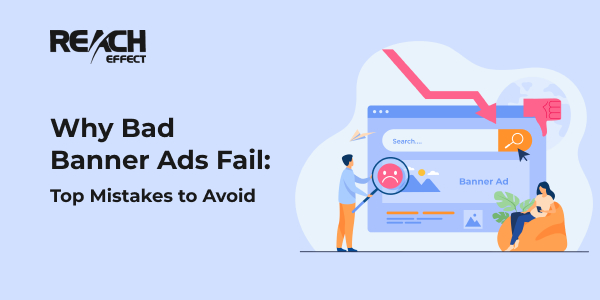
Bad banner ads can be like that annoying pop song stuck in your head, except no one wants to listen. They clutter screens, disrupt our online experience, and often leave us wondering, “Why, oh why?” In this read, we’ll uncover the top mistakes behind these ad blunders.
Common Features of Bad Web Banners
Bad web banners are like a raincloud on a sunny day, spoiling the digital landscape. In this section, we’ll dissect their common features so you can steer clear and make better banners.
Overloading With Information
Stuffing too much data into web banners confuses and overwhelms viewers, causing them to ignore your message. Simple is better!
Ignoring Brand Consistency
Ignoring brand consistency means your banner doesn’t match your brand’s look and feel. It leaves viewers puzzled and detached. Stay cohesive!
Not Targeting the Right Audience
The inability to choose the right audience leads to problems. Then, web banners fail to deliver the desired results, wasting resources and failing to attract potential customers.
Lack of Clear Messaging
Lack of clear messages leads to web banners becoming incomprehensible. Simple and concise messages are banner ad design best practices to attract the audience’s attention.
Poor Graphics and Visuals
Poor graphics and visuals on web banners give a bad impression. They cannot grab the viewers’ attention or effectively convey information.
Non-responsive or Non-interactive Elements
Web banners with unresponsive or non-interactive elements are not appropriate. They give the impression of static and make bad banner ads.

Advanced Tips for Design Banner Ads Success
Step up your banner ad game! We invite you to consider banner ad design best practices. With these practices, you can create banner ads that engage your audience and drive success.
Color Psychology in Banners
The psychology of color in banners is an important aspect. You can use colors to evoke emotions and actions. They influence viewers’ perceptions and interactions with your ads.
Mobile Optimization & Responsiveness
Mobile optimization and responsiveness ensure that you get rid of bad web banners. It will be adapted to different devices.
Testing & Iterating Designs
Testing and design iterations include trying out different versions of banner ads. Also, don’t forget about collecting data and improving based on the results.
Include a Clear Call-to-Action
A clear call to action is like a signpost telling your audience exactly what to do next. An example is “Learn More,” “Subscribe,” and others. It is essential for guiding visitors and achieving promotional goals.
Conclusion
In conclusion, professional help can help you avoid common mistakes with bad banner ads. Leave a request now and get the opportunity to achieve unprecedented heights.

