I still remember the first time I learned about the 468×60 banner ad. It was during a conversation with a veteran digital marketer who pointed at a small horizontal banner at the bottom of a webpage and said, “That little guy right there? It’s technically a dinosaur, but it’s still bringing in revenue.” That statement stuck with me because it perfectly captures what the banner 468×60 represents in today’s advertising landscape.
Thank you for reading this post, don't forget to subscribe!The 468×60 banner ad holds a special place in digital advertising history. It was actually the very first banner ad format ever created, appearing online back in 1994. While it might seem outdated compared to the flashy, large-format ads we see today, this compact banner still plays a meaningful role in banner advertising. At Reacheffect, we’ve seen countless campaigns where these smaller banners contribute steady incremental revenue when used correctly.
Understanding the 468×60 Banner Ad Format
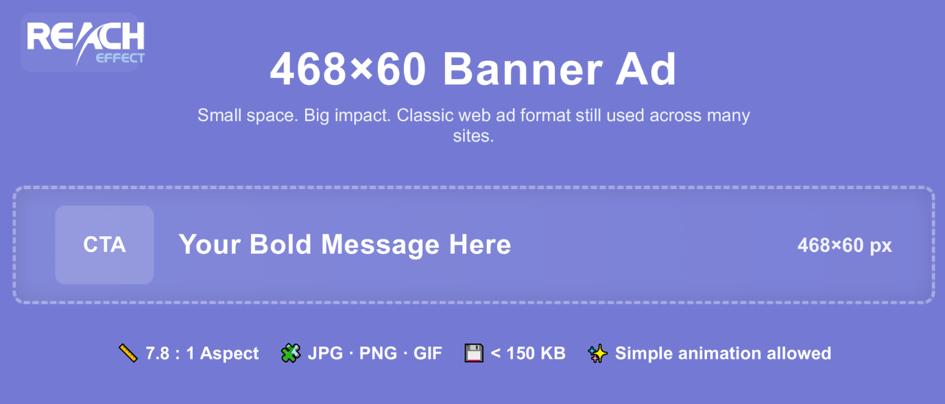
The 468×60 banner ad is a horizontal rectangular display ad that measures exactly 468 pixels wide by 60 pixels tall. To put that in perspective, it takes up about 28,080 pixels of screen space. That might sound substantial until you compare it to its successor, the 728×90 leaderboard, which occupies more than double that space at 65,520 pixels.
This size limitation is both a challenge and an opportunity. The challenge lies in creating something compelling within such constrained dimensions. The opportunity comes from the fact that these banners remain widely available across older websites and can often be purchased at lower rates than premium ad placements.
Key specifications for the 468×60 banner ad:
- Dimensions: 468 pixels wide × 60 pixels tall
- Aspect ratio: 7.8:1
- Common file formats: JPG, PNG, GIF
- Recommended file size: Under 150 KB (some platforms accept up to 1024 KB)
- Animation: Allowed, but keep it simple and focused
Why the 468×60 Banner Still Matters
You might wonder why anyone would bother with such a small ad format. The answer comes down to three factors: availability, cost, and incremental revenue.
Many established websites, particularly smaller niche sites, still offer 468×60 banner ad slots as their primary advertising option. These sites may not have updated their layouts in years, but they often maintain loyal, engaged audiences. When you’re running display campaigns through platforms like Reacheffect, having creative assets in multiple sizes, including the 468×60 banner ad, ensures you can reach these additional inventory sources.
The cost factor matters too. Because larger banner sizes typically command premium pricing, the 468×60 format often comes at a fraction of the cost. This makes it ideal for testing new markets, running supplementary awareness campaigns, or capturing that extra bit of reach without breaking your budget.
Design Best Practices for 468×60 Banner Ads
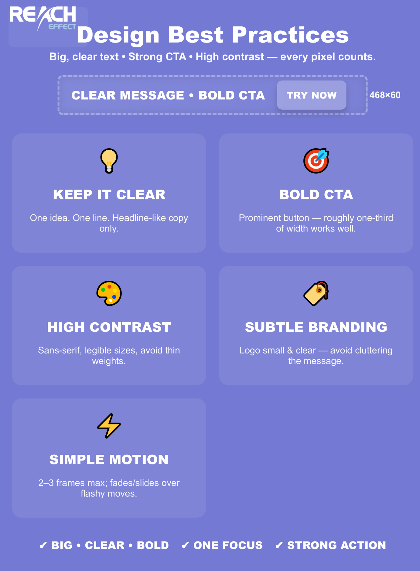
Creating an effective 468×60 banner ad example requires a different mindset than designing larger formats. You’re working with minimal real estate, so every pixel needs to earn its place.
Keep Your Message Crystal Clear
The biggest mistake I see with 468×60 banner ads is trying to cram too much information into the space. Your banner should communicate one single, focused idea. Think of it as the headline of your advertisement, not the entire story.
For example, instead of trying to list three product benefits, choose the strongest one. Instead of including your full company tagline, use a short, punchy phrase. The goal is immediate comprehension within the first second of viewing.
Make Your Call-to-Action Bold and Unmistakable
In a banner this size, your call-to-action needs to be direct and visible. Words like “Shop Now,” “Learn More,” “Try Free,” or “Get Started” work well because they’re short and action-oriented. Consider using a contrasting color for your CTA button to make it stand out from the rest of your design.
A good rule of thumb is to dedicate roughly one-third of your banner width to the CTA button. This ensures it’s prominent enough to be noticed and clicked, even on smaller screens.
Use High-Contrast Colors and Readable Typography
At 60 pixels tall, you don’t have room for subtle color gradients or elaborate font styling. Choose colors that create strong contrast, making text instantly readable. Dark text on light backgrounds or vice versa works best.
For typography, stick to sans-serif fonts at 12 pixels or larger for body text, and 16-20 pixels for headlines. Anything smaller becomes difficult to read, especially on standard resolution displays. Avoid script fonts, thin weights, or condensed typefaces that sacrifice legibility.
Incorporate Your Branding Thoughtfully
Your logo should appear in the banner, but it doesn’t need to dominate. A small, clear logo placement in one corner maintains brand recognition without consuming valuable space. Use your brand’s color palette to create visual consistency, but don’t feel obligated to include every brand element.
Consider Animation Carefully
Animated 468×60 banner ads can attract more attention than static versions, but animation in such a small space requires restraint. Simple transitions work better than complex sequences. A good approach is to show 2-3 frames maximum, each displaying for about 2-3 seconds.
Effective animation patterns for this format include simple fades, slides, or reveals that draw the eye to your main message or CTA. Avoid rapid flashing, spinning elements, or anything that might feel aggressive or annoying to viewers.
Strategic Placement and Usage
The traditional placement for a 468×60 banner ad is at the top or bottom of webpage content, often in the space where larger leaderboard ads would typically appear. Many sites actually display two of these banners side by side to fill the width of their content area.
This positioning strategy works because it places your ad where users naturally pause after reading content or when first arriving at a page. Bottom placements, in particular, can capture attention from engaged users who’ve scrolled through the entire page.
When working with programmatic platforms, these banners often fill through multi-size ad slots. This means your 468×60 creative might compete with larger formats for the same placement. To maximize success, ensure your message is compelling enough to perform even when adjacent to bigger ads.
Real-World Performance Expectations
I want to be honest about performance metrics because managing expectations is crucial for campaign success. The 468×60 banner ad typically delivers lower click-through rates compared to larger formats. An average CTR of around 2% (2 clicks per 100 impressions) is considered decent for display ads generally, and you should expect something lower for this smaller format.
However, lower CTR doesn’t necessarily mean lower value. When purchased at the right price point, these banners can deliver positive ROI through sheer volume. They work particularly well for brand awareness campaigns where impressions matter more than immediate clicks.
Mobile performance presents an interesting consideration. While the 468×60 format was designed for desktop browsers, it’s now frequently served on tablets as well. On mobile phones, however, it’s generally too large and gets replaced by mobile-specific sizes like 320×50.
Tools and Resources for Banner Creation
Several platforms make creating professional 468×60 banner ads accessible, even without advanced design skills. Tools like Canva, Bannersnack, and Creatopy offer templates specifically sized for this format. These platforms provide intuitive drag-and-drop interfaces where you can customize colors, fonts, and images to match your brand.
For those comfortable with professional design software, Adobe Photoshop and Illustrator remain excellent choices, giving you complete creative control. Just remember to set up your canvas at exactly 468×60 pixels before you start designing.
When exporting your final banner, choose file formats carefully. Static banners work well as JPG or PNG files, with PNG being preferable if you need transparency. For animated banners, GIF remains the standard format, though HTML5 is increasingly common for more complex animations.
Making the 468×60 Work for Your Campaigns
Success with the banner 468×60 comes down to setting appropriate expectations and using it strategically within your broader advertising mix. Don’t expect this format to carry your entire campaign, but don’t dismiss it as worthless either.
Consider using 468×60 banners for retargeting campaigns, where you’re reaching people who’ve already interacted with your brand. These users need less detailed information, making the compact format perfectly adequate for reinforcing your message and driving them back to your site.
They also work well for consistent brand presence across many sites. When your goal is maintaining awareness rather than making an immediate sale, these smaller, more affordable placements let you maintain visibility across numerous properties without exhausting your budget.
Final Thoughts
The 468×60 banner ad might be a veteran of the digital advertising world, but it’s far from retired. By understanding its limitations and designing accordingly, you can create effective small-format ads that contribute meaningfully to your campaign objectives.
Remember that every banner size serves a purpose in a comprehensive display strategy. The 468×60 fills a specific niche: incremental reach on older websites, cost-effective awareness building, and supplementary placements that round out your campaign coverage.