




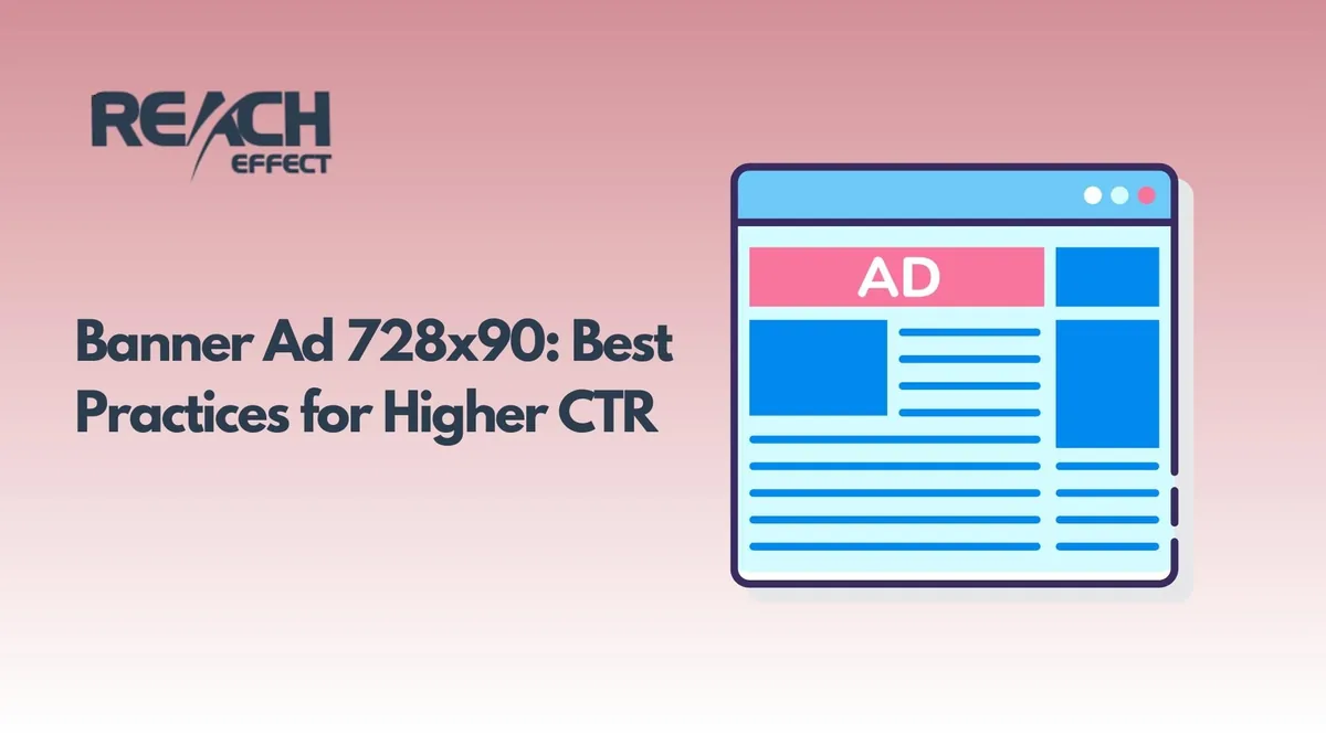
When effectively optimized, the 728×90 ad banner can generate amazing results. This type of leaderboard layout not only grabs people’s attention right as they enter a page but also gives you a 3-second window to make a first impression. Most advertisers fail to seize this opportunity, but understanding the psychology behind banner ads might totally change the game of your campaigns for the better.
Why the 728×90 Banner Ad Format is the Best
The 728×90 banner ad format is a great choice since it interferes with how people naturally read. Most people tend to scan a website following an F-shaped pattern and their focus is mainly on the top horizontal parts of pages. Being right there in that highly sought-after user attention spot is exactly what this layout can offer.
In contrast to other banner sizes that are fighting for limited space, a 728×90 banner has enough horizontal area which even looks to users like a usual one. It neither interrupts the content flow like vertical banners do, nor is it so small and easily ignored as other sizes.
Advanced Design Strategies That Actually Convert
It is not uncommon to see many 728×90 banner ad samples still being created according to outdated rules. On the contrary, the highest converting and best-performing banners have made it a point to be very selective in breaking their guidelines:
The 60-30-10 Color Psychology Rule:
- The most dominant color should cover 60% of the banner space (usually the background)
- The brand’s secondary color accounts for 30% (headlines, borders, graphics)
- The accent color remains only 10% for the call-to-action buttons
- These percentages lead to a natural visual hierarchy without annoying the users.
Typographical hierarchy to grab micro-attention spans:
- Headlines: Use large fonts (24-28px) that can be read in 1 second or less
- Subtext: Select medium-sized fonts (14-16px) for your explanatory words (keep the text length up to 5 to 7 words)
- CTA text: Get the action verbs at 16-18px font size
- Font pairs should offer a strong contrast between each other as well as between the website fonts.
Planned white space allocation:
- Keep 15-20% of the banner space as white space
- The area around CTA buttons gives a 23% increase in user interaction
- Thoroughly packed designs tend to decrease the perceived trustworthiness of the offers
One of the most important factors that determine your banner’s success is placing your CTA button right. Some researches say that 728×90 banners work differently than the other sizes, mainly because, according to eye-tracking studies, we read horizontally.
The positioning method with the golden ratio:
- Place your CTA button 618 pixels away from the left border of your banner
- This position is highly effective for catching the user’s eye after they’ve read the headline
- Buttons positioned there are clicked 34% more often than the ones located at the center
- Right-oriented buttons fit western audiences while left-oriented are more appropriate for Middle Eastern markets
Psychology of CTA Button Triggers:
- Choose a button color that contrasts with the rest of the site and is not used anywhere else
- Button text should be strong enough to act but not sound begging
- 120-140 pixels is the perfect button width range for accurately thumb-tapping
- By incorporating slight shadows or gradients you will add both clickability and depth cues
Top-notch campaigns feature switching CTAs reacting to user behavior or even time of the day. Luckily, advanced targeting capabilities are reachable through platforms like ReachEffect.
Revenue Maximizing Strategic Positioning
The advertiser’s refusal to tap into the powerhouse of banner placement is quite baffling as it makes a huge difference in the performance, more than four times to be exact. Looking at click-through rates makes it very clear what separates the very best placements from the ordinary ones.
New Premium Placement Order:
- Header placements above the nav menu stations secure 67% more attention
- Content within paragraphs placements received 43% more engagement
- It is the end-of-article placement that gives the best results for consideration stage messaging
- Sidebar positions can only achieve their effectiveness when the desktop-supported content
Advanced Targeting Integration:
- Product banners on the category pages lead to a 2x increase in conversion rates
- Educative banners linked to blog posts are the most effective sales tool as they help in winning consumer trust
- Retargeting banners should be displayed on heavy-traffic pages where the prospects are already browsing
- Time-sensitive offers receive their highest-scoring results on the homepage header during peak traffic hours
Through using Reacheffect and similar platforms, smart advertisers can switch to real-time data driven optimization of placements across thousands of websites running simultaneously.
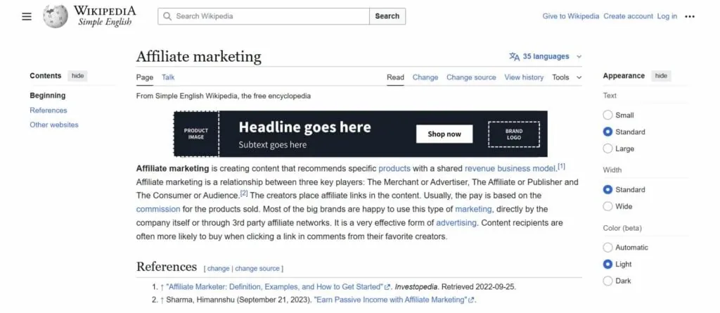
Mobile Optimization Secrets Most Advertisers Miss
Just as 728×90 banners are one thing on desktops, so are they totally different for mobile users. The latter’s touch behavior, attention spans, and viewing contexts need specially-made optimization strategies.
Usually responsive scaling is the villain of a story that destroys the effectiveness of banners. You should first design mobile banner ads that perfectly fit smaller screens and then scale them up for desktop. By doing so, you keep the readability and conversion rates unchanged in both cases.
Having the right size of elements for the finger tap is a must for mobile success. Besides that, CTA buttons should not be put near screen edges where tap is accidental. On the other hand, desktop users, by and large, are willing to accept multi-step operations, whereas mobile users prefer a single tap action.
Testing Strategies That Reveal Hidden Opportunities
Meanwhile, marketers test the most obvious elements such as colors and female leaders. The single biggest performance improvements come from experiments with psychological triggers and the times of the day that the competitors simply do not consider.
Compare the scarcity angle with benefit-oriented content. Very often, limited-time offers outperform feature-heavy or specification banners, however, your target market and industry will ultimately decide the exact sweet spot.
Frequency capping is an issue that should receive substantially more attention than the creative test is getting. Constant exposure to the same banner 2-3 times does, in fact, create better results than showing 3 different ones once each.
Sequential messaging campaigns with 728×90 banners are a more efficient tool for lead nurturing in comparison with the single impression approach.
Industry Performance Benchmarks and Insider Insights
The performance of 728×90 banner ads can be very different depending on which industry is running them. Having a solid grasp of these performance benchmarks can help you set realistic goals as well as bring your efforts for optimization to a new level.
Ecommerce banners with images of products and price tags, generally, enjoy the highest click-through rates of 1.2-2.1%. Those service companies which center their communications around the benefits of the services, will have lower click rates (0.8-1.4%) but the value of their conversions will be higher.
The B2B businesses have been known to miss the powerful impact that comes from educational banner content. When banners that are aimed at providing valuable industry reports or holding exclusive webinars get properly targeted, the click rates reach as much as 3-5%.
While the financial services industry has compliance requirements as a major barrier, within the regulatory guidelines, the performance can be dramatically increased by the use of trust signals and social proof elements.
Advanced Measurement and ROI Optimization
Good measurement went far beyond the simple click-through rate. Metrics such as view-through conversions, assisted conversions, and brand lift give a much deeper understanding of the effectiveness of banner campaigns. If you are still deciding whether banners belong in your media mix, our overview of the advantages of banner ads makes the case for the format.
The most efficient campaigns identify and track micro-conversions as those single steps that gradually move consumers to the final stage of the marketing funnel. These could be the cases where customers sign up for emails, drop the content, or visit product pages which all together lead to a conversion.
The cost per acquisition (CPA) varies very much depending on the extent of targeting and the quality of the creative. Through better targeting and alignment of the message, the most successful 728×90 banners deliver the CPA that is 40-60% lower than the industry average.
Critical Mistakes That Kill Campaign Performance
The major share of 728×90 banner ad failures comes from the mistakes which are so obvious that once they are made, the user trust as well as the engagement are instantly lowered.
Too much information on the banner, not only makes the users confused but also lowers the possibility of an action being taken. Since we have only 90 pixels vertically, we have to be very effective in using that space and presenting only one core value proposition. The additional information can be put on the landing page, not in the banner.
High-resolution pictures which are adjusted for the web should always be used. Fuzzy or poor-quality graphics can lower the user’s overall brand preferences. Images that look like those used by amateurs, are banners that don’t get the click.
Common stock photography is the biggest killer of authenticity as well as trust. Users have an immediate reaction to the overused stock images, hence, if original photos are used instead, you will see a 25-40% higher click-through rate.
If you ignore loading speed, users will get annoyed and your performance will suffer. Regularly check your banner file sizes, especially for mobile as there could be situations that a user has a slow connection or limited data plan.
Future-Proofing Your 728×90 Banner Strategy
The digital advertising world is very changeable and those who are successful continuously evolve their banner strategy. We already see interactive elements, personalized messaging, and AI-based optimization radically changing banner advertising effectiveness.
GDPR and iOS are two kinds of regulation that force marketers to use first-party data and contextual targeting more. This trend is actually good for well-designed 728×90 banners as they can perform even without using intrusive tracking methods.
Machine learning has now made it possible to have dynamic creative optimization that will adjust the text, colors, and calls-to-action based on real-time performance data automatically. Using this kind of technology, small advertisers can compete with big ones running enterprise-level campaigns.
Those advertisers who promptly incorporate human creativity and data- driven optimization are the ones who will be the winners tomorrow. Automation handles the tedious analytical and testing tasks that previously required manual management. Meanwhile, understanding user psychology is still key.